Color
Graphic Design for Dancers, Part 2
by Lida
posted November 16, 2014
Part 1 available here
This is the second in a series of articles on graphic design for dancers. In the first article we considered the impact of design on the public’s perception of the dance and on the success of bellydance as a business, then explored crucial typography guidelines. Now we’ll delve into applying colors in marketing materials, returning to the ever-present concepts of hierarchy and legibility introduced previously.
In design, color is used to:
- Convey a mood or feeling
- Draw attention to certain elements
- Group and structure related elements
- Enhance the message
- Establish brand identity
While color can be a great asset to your work, its improper use can thwart your efforts to present professional, polished, and sophisticated pieces. It can be easy to give enthusiasm free reign and go a bit overboard but, in design as in dance, it pays to exercise restraint. That’s why the following essential points, gleaned from my years of design work, focus on subtlety to allow colors and patterns to support your content instead of stealing focus. I’ve included examples, as well as links to additional resources at the end of the article. This guide applies to both print and web.
Choosing Colors
- Select colors that support your message and audience. If you’re designing a flier for an autumn-themed event, earth and jewel tones are a better fit than pastels. Light colors might work better for a daytime event than a nighttime event. A webpage for children’s classes would need upbeat colors instead of slick and moody colors.
- Use colors as your viewers expect them to be used. Some colors are already established in user design and subconsciously inform user behavior. For example, bright red and yellow are associated with errors and caution, while bright green is associated with successful actions and confirmation. Using bright red for a positive message can be confusing and jarring when users are accustomed to seeing green.
- Get ideas for color combinations from sites like Adobe’s Kuler (see link below).
Creating Hierarchy
- Draw attention to important information with saturated colors, while keeping other colors more desaturated. A flier headline might be brighter than the other elements, or maybe you need to emphasize a deadline date.
- Be consistent with your use of color by using it to relate items with similar content. For example, on an event flier the headline and date might be presented in one color, while the address and ticket price are presented in another color.
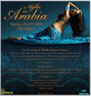
- Keep your color palette limited. A couple of accent colors are enough to draw attention to the most important parts of your message, while too many can be messy and confusing. [Figure 1]
- Keep the colors in your gradients analogous to prevent them from competing with more important elements. [Figure 2]

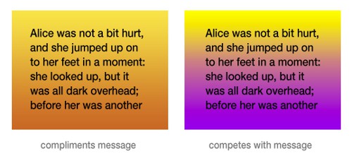
Figure 1 and 2
Ensuring Legibility
- Avoid bright, saturated backgrounds, as they make text difficult to read and distract from images. Desaturated colors are more refined and easy on the eyes. [Figure 3]
- Make sure there is ample contrast between your background and text. Not enough contrast makes the text hard to read. [Figure 4]
- When presenting large amounts of text, use dark text on a light background. Light text on a dark background is hard on the eyes for prolonged reading, especially online. [Figure 5]
- Mute your background patterns to keep text legible and avoid distracting from your content. [Figure 6]

Figure 3

Figure 4
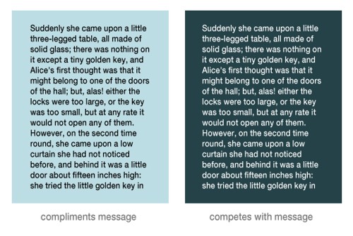
Figure 5

Figure 6
Putting It Together
This flier uses deep blues with accents of medium yellows, a limited palette that retains simplicity and makes sense for a nighttime restaurant event. Saturation and brightness direct the viewer to what they should see first — the headline, date, and image — while the other colors take a secondary role. The background gradient is kept in the same color family and patterns are subdued, letting the information take the spotlight. There is enough contrast between the dark background and the light text for easy reading, and there is not so much text to make it difficult to read in a light-on-dark combination.
[Figure 7]
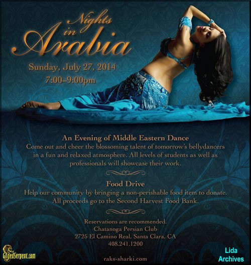
Figure 7
Learn the basics of color theory:
- The Art of Color Coordination –
http://visual.ly/art-color-coordination - Using Color Theory to Create a Better Color Palette –
http://www.dtelepathy.com/blog/design/color-theory
Resources:

Have a comment? Use or comment section at the bottom of this page or Send us a letter!
Check the "Letters to the Editor" for other possible viewpoints!
Ready for more?
- 4-10-14 Typography, Graphic Design for Dancers, Part 1
As artists of an often misunderstood dance, we dancers understand that everything we present publicly reflects back upon us as individuals, upon bellydance as an art form, and by extension, the Middle Eastern culture. When presenting these facets in the most favorable light to other dancers or the general public, good design becomes paramount because it is the most unmistakable way to demonstrate our worth. - 10-24-14 Alive – Inside and Out! Tai Chi Can Enhance Your Dance
Exploring and blending these disciplines has long been my “secret sauce.” Centering and breathing, conscious transitions, body and soul awareness–from footfall to fingertip and beyond–nourish and replenish my dance. - 10-17-14 Retirement, Is There Life After Dance?
Perhaps this was my mistake; I had a plan for my dance career, and I was not shy to tell it to everyone who would listen. - 9-30-14 An Evening of Egyptian Music and Dance, a Report from El Leil
Amina and the Aswan Dancers did it again! The sold out show at the Mission Cultural Center for Latino Arts was another stellar example of the kinds of show their fans have grown to expect and they have not yet been disappointed. - 9-12-14 The Best of the British! The South of England Belly Dance Scene.
Like every area, the UK has seen an ebb and flow in the popularity of belly dance, the economic impact and the rise in popularity of fusions styles has changed the dance from when I first started twenty years ago. Yet I see a strong, healthy and supporting scene posed to expand when disposable income in the general population increases. - 9-6-14 Don’t Come Whining to Me! An Open Letter to Aspiring Young Belly Dancer
If you audition for a Greek restaurant – do NOT come to an audition with anything other than Greek music. - 9-1-14 A Journey to the West Bank, A Lone Dancer Visits Palestine
The refugee children were dressed in sweatpants and T-shirts, like school kids anywhere in the world. The coach was in a tracksuit, and his stern voice echoed over the young crowd. It could easily have been a basketball game, or perhaps a rehearsal for a play, that was about to begin in this gymnastics hall. But this was a dance rehearsal - 7-31-14 Patient is a Bellydancer, Part 2:The New Normal & the Boring Reason I’ll Never Stop Dancing
What was once an exercise in insanity is now how I hip drop and down walk. - 7-16-14 Crossing the Chasm, Cultural Sensitivity and Bellydancing
So how do we start to change the consciousness of people who see our profession as base, both inside and outside of the Middle East? I think it must start with a good understanding of the culture behind the dance, by condemning the culture or completely disregarding it in our art form, we have lost touch with our artistic role in society and thus have lost the ability to alter it. - 7-14-14 A Refuge for Innovation, Tribal Fest 2014
Although Tribal Fest is a live on stage, face-to-face event, it is the danced realization of a world in which the technological flows of transportation and communication bring images and bodies into correspondence with each other, and through the form create new images that move a global popular culture dialogue forward. - 4-21-14 Colorful Maghreb in Los Angeles, A Celebration of Music and Dance,
“Dancing In The Sunset ~ A Celebration of Maghreb Music and Dance” held February 1, 2014 at the Live Arts LA Theater in Los Angeles, California
Sorry, comments for this entry are closed at this time.